  |
  |                                                  |   0%
  |
  |                                                  |   1%
  |
  |=                                                 |   1%
  |
  |=                                                 |   2%
  |
  |=                                                 |   3%
  |
  |==                                                |   3%
  |
  |==                                                |   4%
  |
  |==                                                |   5%
  |
  |===                                               |   5%
  |
  |===                                               |   6%
  |
  |===                                               |   7%
  |
  |====                                              |   7%
  |
  |====                                              |   8%
  |
  |====                                              |   9%
  |
  |=====                                             |   9%
  |
  |=====                                             |  10%
  |
  |=====                                             |  11%
  |
  |======                                            |  11%
  |
  |======                                            |  12%
  |
  |======                                            |  13%
  |
  |=======                                           |  13%
  |
  |=======                                           |  14%
  |
  |=======                                           |  15%
  |
  |========                                          |  15%
  |
  |========                                          |  16%
  |
  |========                                          |  17%
  |
  |=========                                         |  17%
  |
  |=========                                         |  18%
  |
  |=========                                         |  19%
  |
  |==========                                        |  19%
  |
  |==========                                        |  20%
  |
  |==========                                        |  21%
  |
  |===========                                       |  21%
  |
  |===========                                       |  22%
  |
  |===========                                       |  23%
  |
  |============                                      |  23%
  |
  |============                                      |  24%
  |
  |============                                      |  25%
  |
  |=============                                     |  25%
  |
  |=============                                     |  26%
  |
  |=============                                     |  27%
  |
  |==============                                    |  27%
  |
  |==============                                    |  28%
  |
  |==============                                    |  29%
  |
  |===============                                   |  29%
  |
  |===============                                   |  30%
  |
  |===============                                   |  31%
  |
  |================                                  |  31%
  |
  |================                                  |  32%
  |
  |================                                  |  33%
  |
  |=================                                 |  33%
  |
  |=================                                 |  34%
  |
  |=================                                 |  35%
  |
  |==================                                |  35%
  |
  |==================                                |  36%
  |
  |==================                                |  37%
  |
  |===================                               |  37%
  |
  |===================                               |  38%
  |
  |===================                               |  39%
  |
  |====================                              |  39%
  |
  |====================                              |  40%
  |
  |====================                              |  41%
  |
  |=====================                             |  41%
  |
  |=====================                             |  42%
  |
  |=====================                             |  43%
  |
  |======================                            |  43%
  |
  |======================                            |  44%
  |
  |======================                            |  45%
  |
  |=======================                           |  45%
  |
  |=======================                           |  46%
  |
  |=======================                           |  47%
  |
  |========================                          |  47%
  |
  |========================                          |  48%
  |
  |========================                          |  49%
  |
  |=========================                         |  49%
  |
  |=========================                         |  50%
  |
  |=========================                         |  51%
  |
  |==========================                        |  51%
  |
  |==========================                        |  52%
  |
  |==========================                        |  53%
  |
  |===========================                       |  53%
  |
  |===========================                       |  54%
  |
  |===========================                       |  55%
  |
  |============================                      |  55%
  |
  |============================                      |  56%
  |
  |============================                      |  57%
  |
  |=============================                     |  57%
  |
  |=============================                     |  58%
  |
  |=============================                     |  59%
  |
  |==============================                    |  59%
  |
  |==============================                    |  60%
  |
  |==============================                    |  61%
  |
  |===============================                   |  61%
  |
  |===============================                   |  62%
  |
  |===============================                   |  63%
  |
  |================================                  |  63%
  |
  |================================                  |  64%
  |
  |================================                  |  65%
  |
  |=================================                 |  65%
  |
  |=================================                 |  66%
  |
  |=================================                 |  67%
  |
  |==================================                |  67%
  |
  |==================================                |  68%
  |
  |==================================                |  69%
  |
  |===================================               |  69%
  |
  |===================================               |  70%
  |
  |===================================               |  71%
  |
  |====================================              |  71%
  |
  |====================================              |  72%
  |
  |====================================              |  73%
  |
  |=====================================             |  73%
  |
  |=====================================             |  74%
  |
  |=====================================             |  75%
  |
  |======================================            |  75%
  |
  |======================================            |  76%
  |
  |======================================            |  77%
  |
  |=======================================           |  77%
  |
  |=======================================           |  78%
  |
  |=======================================           |  79%
  |
  |========================================          |  79%
  |
  |========================================          |  80%
  |
  |========================================          |  81%
  |
  |=========================================         |  81%
  |
  |=========================================         |  82%
  |
  |=========================================         |  83%
  |
  |==========================================        |  83%
  |
  |==========================================        |  84%
  |
  |==========================================        |  85%
  |
  |===========================================       |  85%
  |
  |===========================================       |  86%
  |
  |===========================================       |  87%
  |
  |============================================      |  87%
  |
  |============================================      |  88%
  |
  |============================================      |  89%
  |
  |=============================================     |  89%
  |
  |=============================================     |  90%
  |
  |=============================================     |  91%
  |
  |==============================================    |  91%
  |
  |==============================================    |  92%
  |
  |==============================================    |  93%
  |
  |===============================================   |  93%
  |
  |===============================================   |  94%
  |
  |===============================================   |  95%
  |
  |================================================  |  95%
  |
  |================================================  |  96%
  |
  |================================================  |  97%
  |
  |================================================= |  97%
  |
  |================================================= |  98%
  |
  |================================================= |  99%
  |
  |==================================================|  99%
  |
|==================================================| 100%Visual Explanations of the Explainers, to Gain Insight into Predictions from High-Dimensional Models
Abstract
Explainable Artificial Intelligence (XAI) methods such as SHAP, Counterfactuals and Anchors are used on black box models to understand the contributions from features. Traditional analysis of XAI methods focuses primarily on using numerical values to assess feature contributions. Visualising these explanations together with the observed data gives a clear picture of which facets of the model are explained by each method. In this paper, We propose a set of geometric representations for visualising XAI methods in a two dimensional data space. The proposed representations aim to assist in understanding the contribution of each feature as abstract concepts represented through XAI methods (i.e. the contribution indicated by SHAP is a different contribution to that indicated by LIME). We hope these representations will also aid in researchers who are applying XAI methods to their research problem without being affected by confirmation bias in picking methods that affirm their prior beliefs.
Introduction
Machine learning models are becoming popular in pattern recognition tasks as they allow the data to define the form of the model and thereby understand unforeseen connections between the given variables. However, understanding the learned decision process of these models is difficult due to the opaqueness of these models. Explainable Artificial Intelligence (XAI) methods emerged in response to the increasing complexity and opaqueness of machine learning models and the need to understand how they work, particularly deep learning models. A central aim of XAI is to provide algorithmic and mathematical methods that gather insights into how black box models make decisions, addressing concerns related to trust, transparency, and accountability in AI systems (Ali et al. 2023).
XAI methods are primarily categorized based on their scope and robustness (Molnar 2022). Based on the scope, XAI methods are categorized as global interpretability methods and local interpretability methods (Molnar, Casalicchio, and Bischl 2020). local methods are used to show the model’s decision process or feature influence for a specific observation of interest. Global interpretability methods are developed by aggregating local explanations to demonstrate the effect of predictor variables on the entire dataset. Common examples for global methods are Partial Dependency Plots (Friedman 2001; Greenwell et al. 2017), Accumulated Local Effect plots (Apley and Zhu 2020) while for local methods, SHAP (Lundberg and Lee 2017), Anchors(Ribeiro, Singh, and Guestrin 2018) and Counterfactuals(Wachter, Mittelstadt, and Russell 2018) are common examples.
XAI methods are also categorized by whether the method is capable of explaining only a set family of machine learning models (e.g. tree based models, neural networks) or any black box model regardless of underlying architecture. In this categorization, XAI methods are divided into two categories: model-specific and model-agnostic. Model specific methods use underlying information about the model’s architecture to provide explanations while the model agnostic methods use the model as a function of the input data to approximate the internal workings of the model. Most XAI methods are model agnostic with a few model specific methods available specifically to deep learning models such as saliency maps (Simonyan, Vedaldi, and Zisserman 2013) and learned feature visualization (Olah, Mordvintsev, and Schubert 2017) where information on the internal gradients are available.
While there are different types of XAI methods available, all XAI methods are built on top of the model that it’s trying to explain and the model itself is built on top of the underlying data. Visually the idea would like as follows.
And when it comes to visualising these layers, each layer has a specific set of methods for visualisation. Starting from the bottom we have the Dataset which we visualise through a multitude of methods using variants of primitive graphical objects such as points, lines and areas. Then we come to the model layer which many visualise in an isolated manner using confusion matrices, the change of metrics through time and other methods (e.g. ROC curves). While these methods show a snapshot of the model and it’s performance, there’s a severe disconnect between the reported model performance and the model’s actual effectiveness in the region where we can reliably make inferences from the data, also called the data space. Therefore to have a holistic view of the model’s understanding of the data, the model needs to be visualised in the data space by plotting the model’s predictive surface on to the data space [Wickham, Cook, and Hofmann (2015).
However, when it comes to the XAI Explanation layer, there’s a gap in connecting the explanations with the model-in-data-space visualisations. Currently many of the XAI visualisation methods focus primarily on showing feature contributions of the model based on different explanation methods Baniecki, Parzych, and Biecek (2023). While these visualisations are effective in communcating the numerical values from explanations, similiar to the earlier case of visualising the model in isolation, these visualisations also suffer from being unable to communicate how the underlying importances relate to the model’s view of the data and the data itself.
In addition, with multiple XAI methods being available, the biggest hurdle in applying these methods is understanding which facet of the black box model is explained through each of these XAI methods. Different XAI methods can highlight various aspects of a model’s behavior and thereby provide different answers to questions regarding the model. This diversity, while powerful, also presents a challenge: practitioners must discern which method is most appropriate for their specific context and what particular aspect of the model’s decision-making process it elucidates. The lack of a unified framework often leaves users uncertain about how to interpret the results provided by different XAI techniques (Lundberg and Lee 2017).
Naturally, since each XAI method is attempting to answer questions on specific aspects of the model, disagreements are bound to occurr between these methods. Resolving these disagreements would require the end user or the practitioner to relate the formulaic representation of the XAI method with the numeric values obtained through each XAI method.
This raises the importance of having a geometric object to represent the meaning behind each XAI methods to the end user, both to resolve disagreements and to unify the explanations with the layers beneath it. Visual representations of local XAI explanations are needed to interpret the model boundary in the local neighborhood and to understand any disagreement that may occur between XAI methods. However, to observe the XAI methods visually we need geometric representations of each XAI method which can translate the abstract outputs of XAI methods into visual formats (objects) easily interpreted by humans. For example a geometric representation of an interval can be a bar, a line, or an error bar (Wickham 2010). We argue that the visualisation of explanations should highlight the underlying concept being explained by the XAI method in relation to the data and the model being used.
Therefore to bridge this gap we shall be proposing several visual objects based on the underlying idea of each XAI method. These visual objects shall therefore be called geometric representations of explanations and we shall demonstrate how these representation can be used in a simple two dimensional setting with a simple random forest model.
For the purpose of this work, our primary focus will be on model agnostic local interpretability methods. Model agnostic methods are robust to a wider range of models and therefore can be used in a multitude of contexts, while local interpretability methods provide a narrower inspection into the decision process of black box models.
By observing how the model’s complex decision process changes for contrasting observations we can identify patterns in the decision process. As decision boundaries becoming increasingly non linear around difficult observations (James et al. 2013), generating individual explanations to understand the decision boundary around given observation becomes essential.
From the plethora of available local interpretability methods, our focus will be on the methods of SHAP, Counterfactuals, and Anchors as they are model agnostic and therefore can be applied to a wide variety of models (Molnar 2022). These four methods have a similar structure that showcase different aspects of the model such as understanding the influence of features on a given prediction and the model boundary associated around the local neighborhood of the prediction.
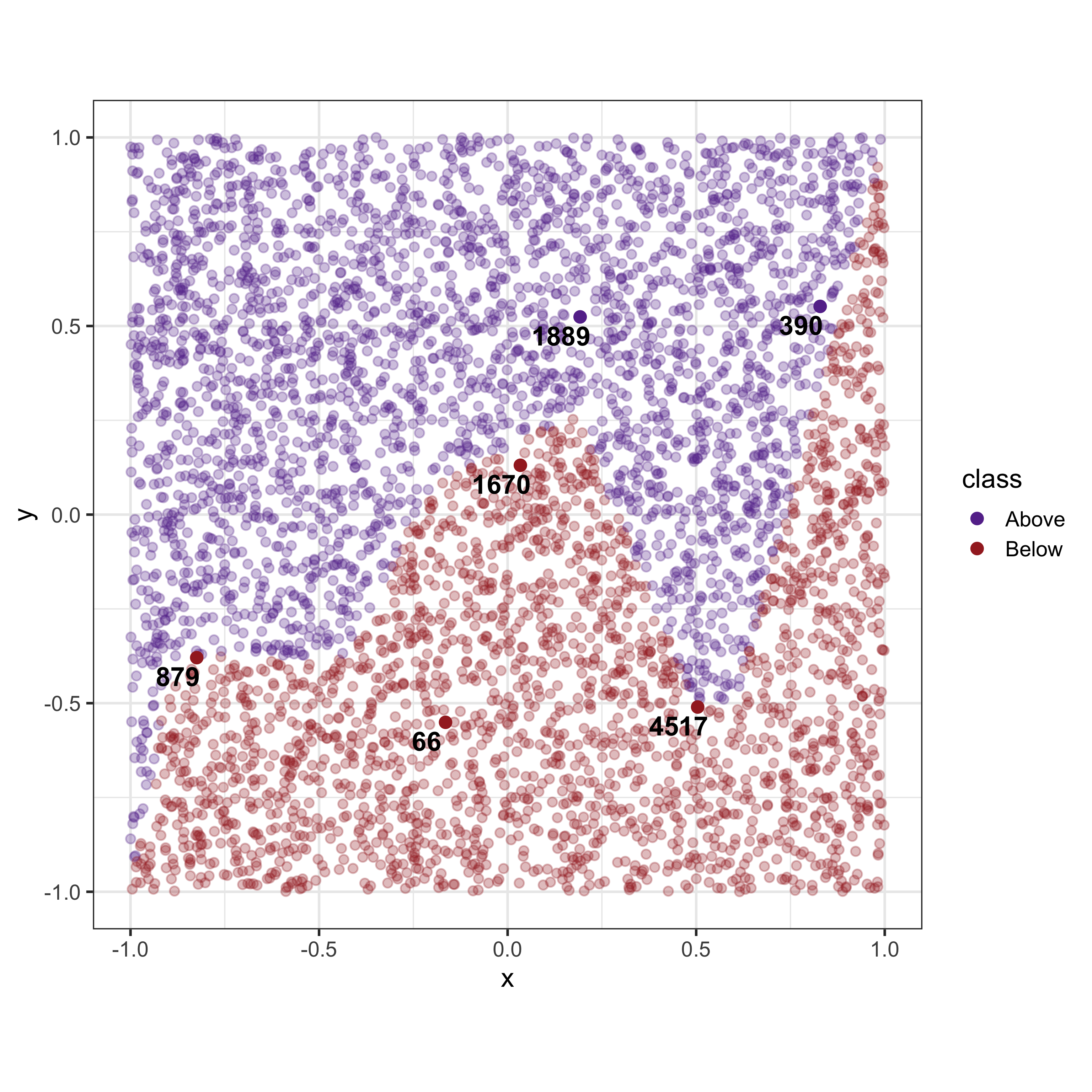
Take for example, the following dataset as shown in Figure 2 which uses simulated data for a two group classification problem. Consider the six observations (labelled 1-6) which would be used as observations (and their associated predictions) of interest to be explained by the explainers.
Given that the dataset consists of only two variables with a reasonably regular non-linear boundary, we would expect that the explainers would provide similar answers. However, as shown in Table 1 there is a considerable disagreement between the explainers.
| case | feature | lime | SHAP | Counterfactuals | Anchors |
|---|---|---|---|---|---|
| 66 | x | 0.5 | 0.06 | 0.34 | 0.06 |
| 66 | y | 0.5 | 0.59 | 0.22 | 0.04 |
| 390 | x | 208.0 | 0.06 | 0.85 | 0.05 |
| 390 | y | -66.5 | 0.39 | 0.36 | 0.03 |
| 879 | x | 23.2 | 0.04 | 1.02 | 0.04 |
| 879 | y | -72.4 | 0.52 | 0.60 | 0.04 |
| 1670 | x | 56.7 | 0.36 | 0.49 | 0.06 |
| 1670 | y | -108.8 | 0.20 | 0.57 | 0.03 |
| 1889 | x | 0.5 | 0.03 | 1.14 | 0.05 |
| 1889 | y | 0.5 | 0.37 | 0.91 | 0.03 |
| 4517 | x | -39.8 | 0.05 | 0.38 | 0.04 |
| 4517 | y | -75.4 | 0.69 | 1.01 | 0.05 |
By mapping geometric representations of explanations into the data space (the data space
Geometric representations of XAI in two dimensions
The task of generating an explanation of a model’s prediction would consist of the effect of each feature and how the model considered these features to come to the prediction.
Historically, for linear models where an analytical form is provided by the fitted model , importance can be assessed based on the magnitude of the coefficient estimates. These can also be adjusted to account for dependence between predictors (Kutner et al. 2005). For this type of model, the importance would be considered global, regardless of the predictor subspace, the relationship with the response is the same.
Supervised machine learning is defined as the task of approximating a function
For machine learning models, where no analytical form is available, determining variable importance may be more difficult yet doable. For example, regression and classification trees, a variable is included or used early in the tree would be considered more important.
With forests, the structure of multiple trees lends itself to computing global variable importance. Dependency between variables, and their importance for the prediction, can be teased apart by the presence or absence of the variables in different trees (James et al. (2013)).
It is inconsistent to extrapolate the feature importance metrics to every observation as black box models have different features that are useful in subareas of the data space. Hence we need to compute feature importance metrics for local observations where the focus is to understand the model boundary around that instance.
A local explanation
In cases such as SHAP where explaining
We can visualise the individual results as it is using the effective visualisation techniques such as bar graphs. However, these techniques can only communicate the explanation itself without any connection to the given observation and where it stands in the data space.
We believe that it would be effective to observe the explanation together with the given observation in the data space. Achieving this goal requires us to rethink how each of these XAI methods should be represented in the data space, as drawing bar graphs in the data space on the given observation will obscure and distort the information given by the explanation and the relative position of the given observation in the data space.
We present the thought process undertaken in developing the geometric representations starting from a two dimensional example and then extending it into high dimensional examples.
SHAP
SHAP values are based on Shapley values defined for cooperative games in game theory. We first present the foundations of Shapley values and translate the components used in the derivation to create SHAP values. In a cooperative game, players are working together to maximize a reward and suppose we need to find out the how the reward should be distributed among each player. Shapley values are the unique solution to this problem that distribute the reward appropriately while satisfying a set of conditions (Lipovetsky and Conklin 2001).
For a coalition game of
The payoff or Shapley value for each
The calculated Shapley values are the only solutions with the following properties
- Efficiency: The sum of Shapely values of all agents is equal to the total for the grand coalition (i.e.
- Symmetry: If
- Linearity: Linear combinations of value function should provide equivalent linear combinations (i.e.
In cases where explaining
For SHAP we will be fitting a linear model around the given observation using the interpretable representation
The built interpretable model
- The model must be faithful to the original model (Local accuracy).
The model gives zero as the feature importance value if the feature is missing from the interpretable representation i.e.
For two blackbox models
If we consider the components of
Evaluating the expectation for every subset of features directly is computationally expensive and therefore numerous model agnostic methods have been proposed to approximate the SHAP values by sampling from the power set of features(Mayer and Watson 2024) with model specific methods for tree based models being able to obtain exact SHAP values (Yang 2021).
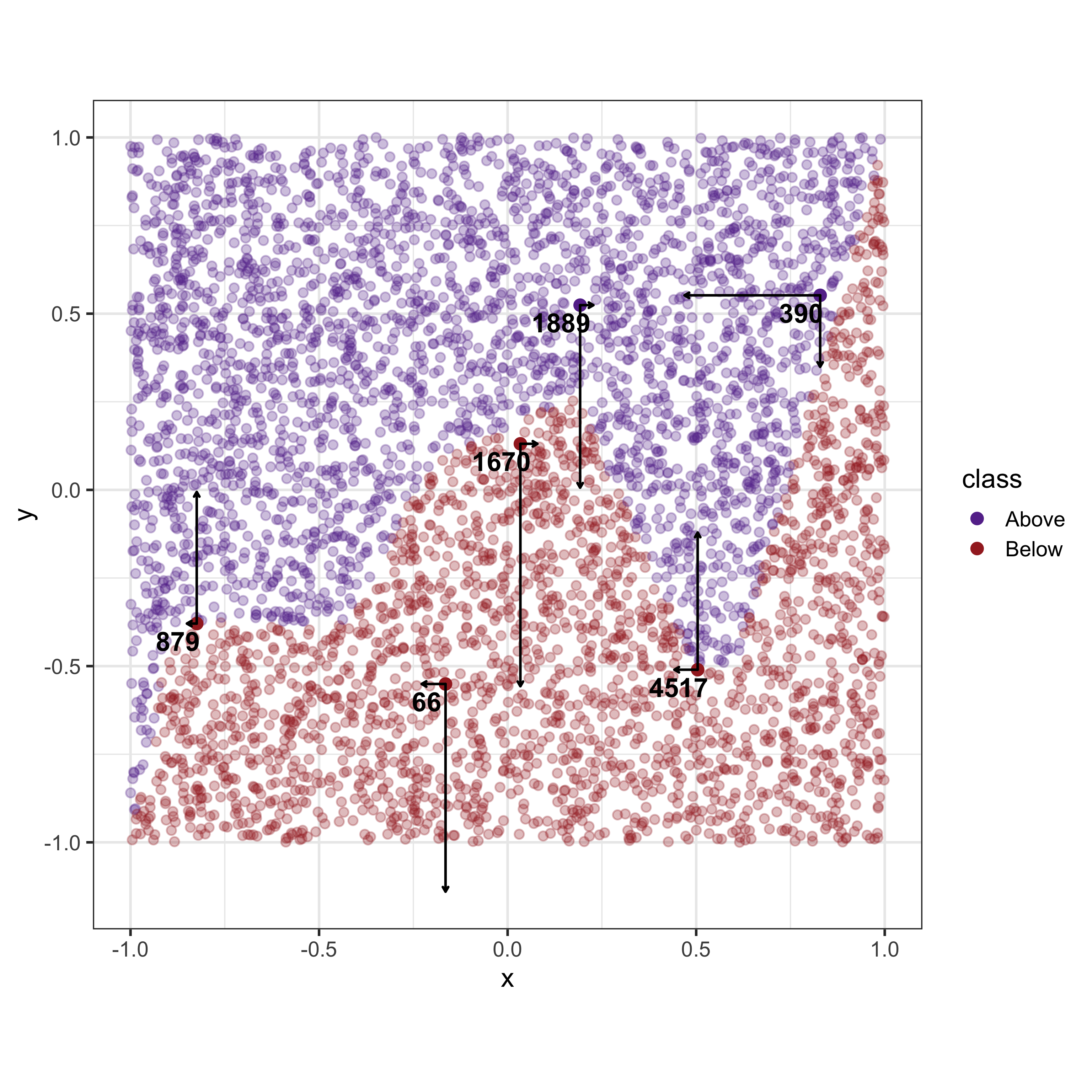
SHAP explanations are also model coefficients estimated to show the change in the expected prediction when the model is with and without the given feature. For a given observation, SHAP explanations can be represented as “forces” or unit vectors pulling the observations in the directions of each dimension. While these unit vectors aren’t necessarily pushing the observation to another place, it is a depiction of the influence that each feature is having on the observation.
LIME
Let us define
To develop a sense of the local model boundary we would need to sample data points around the given data instance
The interpretable model that we define in the local neighborhood needs to have a model boundary as similar as possible to the black box model. Therefore, we define
LIME works by trying to find the simplest model within the local neighborhood that is as similar as possible to the original black box model (Ribeiro, Singh, and Guestrin 2016). Therefore, the local explanation made by LIME is then given by,

The resulting explanation from LIME consists of coefficients from a regression model. Therefore the most effective method of representing the explanation of LIME is to draw a regression line in the data space.
Counterfactuals
A counterfactual explanation for a given observation is the closest unobserved yet plausible data point within the distribution of the dataset that has the desired model output. The main focus of counterfactuals is to show where the given observation needs to go to cross the model boundary with the least amount of changes to the features.
There are many methods of generating counterfactual explanations. In this paper, we will be utilizing Multi Objective Counterfactuals (Dandl et al. 2020) as it has a more intuitive process compared to other approaches. A counterfactual explanation
We will define the above conditions as objective functions. Let
Finding
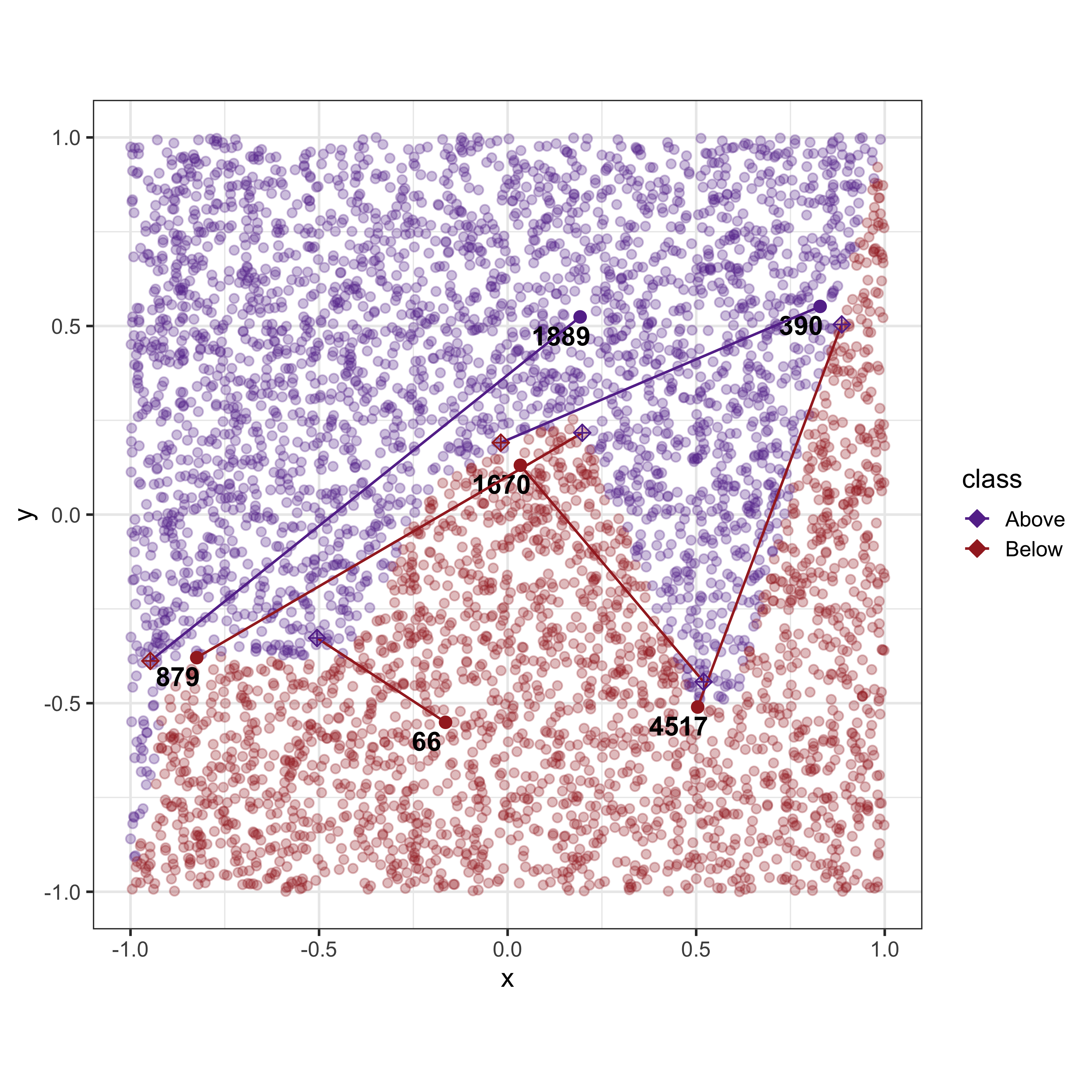
A Counterfactual explanation is another data point itself. However the issue is that the generated data point is unobserved yet plausible. While it is possible to simply plot the point that is given by the counterfactual as a new point it should be highlighted that this point does not exist in the dataset
Anchors
Anchors are defined as a rule or a set of predicates that satisfy the given instance and is a sufficient condition for
For a list of predicates to be an anchor it should satisfy the given instance (i.e. be true for the given instance) while also maximizing two criteria, precision and coverage.
The precision of an anchor
where
For a given tolerance level
The coverage of an anchor
Since a list of predicates is considered to be an anchor if it maximizes the coverage and precision, finding an anchor for a given instance can be defined as the solution to the following optimization problem,
The target would then be to maximize the coverage while ensuring that the precision is above a tolerance level.

| id | x | y | bound | reward | prec | cover |
|---|---|---|---|---|---|---|
| 66 | -0.19 | -0.56 | lower | 0.50 | 1.0 | 0 |
| 66 | -0.13 | -0.52 | upper | 0.50 | 1.0 | 0 |
| 1670 | 0.01 | 0.12 | lower | 0.50 | 1.0 | 0 |
| 1670 | 0.07 | 0.15 | upper | 0.50 | 1.0 | 0 |
| 1889 | 0.17 | 0.51 | lower | 0.50 | 1.0 | 0 |
| 1889 | 0.22 | 0.55 | upper | 0.50 | 1.0 | 0 |
| 4517 | 0.48 | -0.54 | lower | 0.25 | 0.5 | 0 |
| 4517 | 0.52 | -0.49 | upper | 0.25 | 0.5 | 0 |
| 879 | -0.86 | -0.39 | lower | 0.25 | 0.5 | 0 |
| 879 | -0.82 | -0.35 | upper | 0.25 | 0.5 | 0 |
| 390 | 0.81 | 0.54 | lower | 0.50 | 1.0 | 0 |
| 390 | 0.86 | 0.57 | upper | 0.50 | 1.0 | 0 |
Tabel of Anchor values
Anchors are defined as a list of boundary conditions. These boundary conditions should be represented as a
As a summary, each XAI method obtains explanation in three different formats: SHAP provide coefficients of a linear additive model, Counterfactuals provide a new data point (or alternatively the changes made to the features to cross the model boundary) and finally Anchors provides a set of boundaries containing points with similar outcomes as the given observation.
Discussion
visualising the explanations of XAI methods as geometric objects within the data space itself provides a more intuitive and comprehensive understanding of each method. This approach allows users to see how different methods interpret the same data points and their relationships, making the abstract concepts more tangible. By representing high-dimensional data and XAI explanations in a visual format, users can better grasp the underlying patterns and influences driving model decisions.
Disagreements between XAI methods can often be clarified by examining their geometric representations. Different XAI methods may offer varying explanations due to their distinct approaches to estimation and approximation. By visualising these methods geometrically, it becomes easier to identify the root causes of their differences and understand how each method interprets the model’s behavior. This visual approach can reveal the underlying reasons for discrepancies, helping users to reconcile different perspectives and select the most appropriate method for their specific needs.
Bringing the human perspective into XAI is essential for a thorough understanding of both the data and the model. Human intuition and domain knowledge play a crucial role in interpreting complex data and model outputs. By incorporating interactive visualisation tools, users can explore data and model explanations more effectively, leveraging their expertise to uncover insights that automated methods might miss. This human-centric approach ensures that the interpretations are not only technically sound but also practically relevant.
Supplementary material
The case for interactivity, So far we have discussed the importance of establishing a set of geometric representations to better visualise XAI expalanations. However, the last layer of the stack that is ommited from Figure 1 is the human (be it the model developer, a stakeholder or a decision maker). Incorporating the user’s feedback and ideas in to the
Since we are looking at each individual observation separately understanding the model boundary requires us to generate multiple visualisations and compare between them. We can instead use interactive techniques to bring the human perspective present the different aspects of the model to the end user directly. The end user can actively participate in the selection of observations which creates an internal feedback loop to the end user on the choice of XAI method and local observation.
Human interactivity is crucial in enabling the understanding of XAI methods. Since we are looking at each individual observation separately, understanding the model boundary requires us to generate multiple visualisations and compare between them. We can instead use interactive techniques to bring the human perspective and present the different aspects of the model to the end user directly. Interactive tools allow users to explore and manipulate the visual representations of XAI methods, facilitating a deeper and more intuitive understanding of model explanations. Interactivity can include features such as clicking, zooming and shared state management enabling users to investigate specific aspects of the data and model behavior. This hands-on approach helps bridge the gap between complex algorithmic outputs and human comprehension. The end user can actively participate in the selection of observations which creates feedback on the choice of XAI method and local observation.
Combining visualisation and interactivity methods, we suggest a novel approach where each geometric representation is visualised in an interactive environment. By allowing the user to explore, compare and contrast observations and explainers users can understand the different facets of the black box model that each XAI method reveals. Our proposed solution integrates advanced visualisation techniques with interactive interfaces to create a dynamic, user-friendly platform for exploring XAI methods. This approach allows users to switch between different XAI methods, observe how explanations change with different data points, and gain insights into the model’s decision process. By providing an interactive environment, we aim to make the understanding of complex AI models more accessible and actionable for developers and end users alike.
References
Ali, Sajid, Tamer Abuhmed, Shaker El-Sappagh, Khan Muhammad, Jose M. Alonso-Moral, Roberto Confalonieri, Riccardo Guidotti, Javier Del Ser, Natalia Díaz-Rodríguez, and Francisco Herrera. 2023. “Explainable Artificial Intelligence (XAI): What We Know and What Is Left to Attain Trustworthy Artificial Intelligence.” Information Fusion 99: 101805. https://doi.org/https://doi.org/10.1016/j.inffus.2023.101805.
Apley, Daniel W, and Jingyu Zhu. 2020. “Visualizing the Effects of Predictor Variables in Black Box Supervised Learning Models.” Journal of the Royal Statistical Society Series B: Statistical Methodology 82 (4): 1059–86.
Baniecki, Hubert, and Przemyslaw Biecek. 2019. “modelStudio: Interactive Studio with Explanations for ML Predictive Models.” Journal of Open Source Software 4 (43): 1798. https://doi.org/10.21105/joss.01798.
Baniecki, Hubert, Dariusz Parzych, and Przemyslaw Biecek. 2023. “The Grammar of Interactive Explanatory Model Analysis.” Data Mining and Knowledge Discovery, 1–37. https://doi.org/10.1007/s10618-023-00924-w.
Dandl, Susanne, Christoph Molnar, Martin Binder, and Bernd Bischl. 2020. “Multi-Objective Counterfactual Explanations.” In Parallel Problem Solving from Nature – PPSN XVI, edited by Thomas Bäck, Mike Preuss, André Deutz, Hao Wang, Carola Doerr, Michael Emmerich, and Heike Trautmann, 12269:448–69. Cham: Springer International Publishing. https://doi.org/10.1007/978-3-030-58112-1_31.
Friedman, Jerome H. 2001. “Greedy Function Approximation: A Gradient Boosting Machine.” Annals of Statistics, 1189–1232.
Greenwell, Brandon M et al. 2017. “Pdp: An r Package for Constructing Partial Dependence Plots.” R J. 9 (1): 421.
James, Gareth, Daniela Witten, Trevor Hastie, Robert Tibshirani, et al. 2013. An Introduction to Statistical Learning. Vol. 112. Springer.
Kutner, Michael H, Christopher J Nachtsheim, John Neter, and William Li. 2005. Applied Linear Statistical Models. McGraw-hill.
Lipovetsky, Stan, and Michael Conklin. 2001. “Analysis of Regression in Game Theory Approach.” Applied Stochastic Models in Business and Industry 17 (4): 319–30.
Lundberg, Scott M, and Su-In Lee. 2017. “A Unified Approach to Interpreting Model Predictions.” Advances in Neural Information Processing Systems 30.
Mayer, Michael, and David Watson. 2024. Kernelshap: Kernel SHAP. https://github.com/ModelOriented/kernelshap.
Molnar, Christoph. 2022. Interpretable Machine Learning: A Guide for Making Black Box Models Explainable. Second edition. Munich, Germany: Christoph Molnar.
Molnar, Christoph, Giuseppe Casalicchio, and Bernd Bischl. 2020. “Interpretable Machine Learning – A Brief History, State-of-the-Art and Challenges.” In, 1323:417–31. http://arxiv.org/abs/2010.09337.
Olah, Chris, Alexander Mordvintsev, and Ludwig Schubert. 2017. “Feature Visualization.” Distill 2 (11): e7.
Ribeiro, Marco Tulio, Sameer Singh, and Carlos Guestrin. 2016. “"Why Should I Trust You?": Explaining the Predictions of Any Classifier.” https://doi.org/10.48550/ARXIV.1602.04938.
———. 2018. “Anchors: High-Precision Model-Agnostic Explanations.” Proceedings of the AAAI Conference on Artificial Intelligence 32 (1). https://doi.org/10.1609/aaai.v32i1.11491.
Simonyan, Karen, Andrea Vedaldi, and Andrew Zisserman. 2013. “Deep Inside Convolutional Networks: Visualising Image Classification Models and Saliency Maps.” arXiv Preprint arXiv:1312.6034.
Wachter, Sandra, Brent Mittelstadt, and Chris Russell. 2018. “Counterfactual Explanations Without Opening the Black Box: Automated Decisions and the GDPR.” arXiv. http://arxiv.org/abs/1711.00399.
Wickham, Hadley. 2010. “A Layered Grammar of Graphics.” Journal of Computational and Graphical Statistics 19 (1): 3–28.
Wickham, Hadley, Dianne Cook, and Heike Hofmann. 2015. “Visualizing Statistical Models: Removing the Blindfold.” Statistical Analysis and Data Mining: The ASA Data Science Journal 8 (4): 203–25. https://doi.org/10.1002/sam.11271.
Yang, Jilei. 2021. “Fast Treeshap: Accelerating Shap Value Computation for Trees.” arXiv Preprint arXiv:2109.09847.